USPS Mailbox Label Redesign
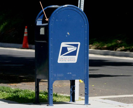
I hardly use these mail drop boxes because I currently live in the suburbs, where wide roads and light traffic make it very convenient to take a trip to the post office. But one day, I was out during rush hour and using the drop box was more convenient since there was already one in the vicinity. I needed to make sure my mail would go out that day, and to my disappointment, what I thought would be a one-minute task became a fifteen-minute one, which included a five-minute call with customer service.
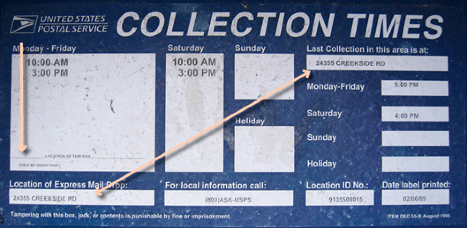
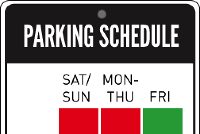
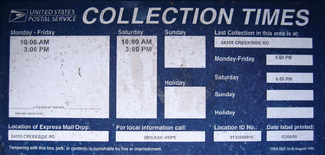
It did not help that the actual collection times were different from the label that was apparently in need of an update. But even then, I could hardly make sense of the rest of the information on it.
Here are the problems I identified:
Problem #1 Confusing information clustering
What information belongs together?
Problem #2 Confusing information hierarchy
Where do I look first?
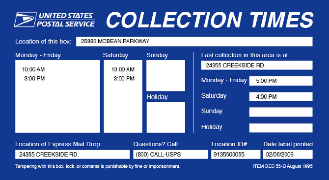
...which I think my redesign solves with just a little tweak here and there.
IN-DEPTH ANALYSIS
Problem #1 Unclear Information Clustering
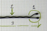
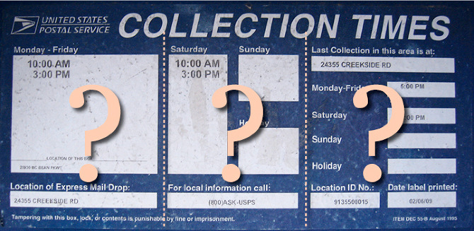
Where am I supposed to look first? Why are there two sets of days?
The first step in trying to understand a body of information is simplifying by grouping. In this mailbox label, it’s not clear which pieces of information are related and which are not. Fields that, at first glance, seem to be related because of deliberate alignment and spacing, are actually not related at all.
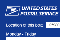
Finally able to group them properly...
Problem #2 Unclear Information Hierarchy
Which group is of primary, secondary, and tertiary importance? I attempt to prioritize them myself, as seen below.
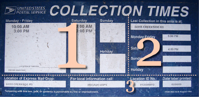
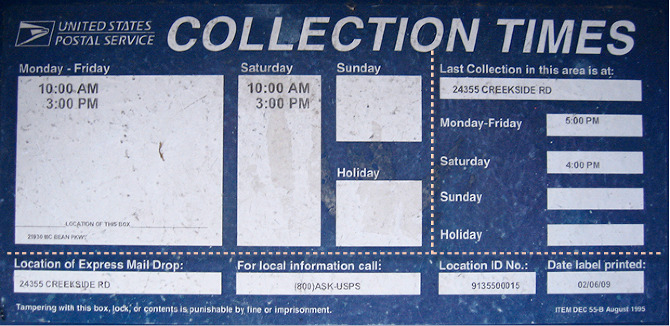
The multiple addresses on this label are confusing to people who are not familiar with the area or who don’t normally use these mail drop boxes. What’s more confusing is that the less important address appears more prominently than the primary one.