Parking Sign Redesign
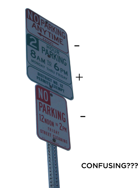
PROBLEM
This sign is the equivalent of a test question that has two negatives in it:
"Which of the following can't not happen?"
Those questions always result in scrunched-up foreheads.
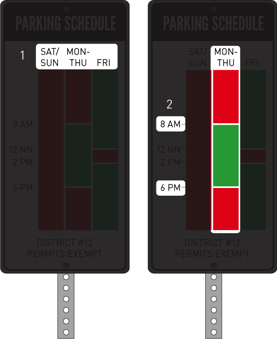
I've gotten two tickets because these street parking signs are so confusing. Apart from that, it requires drivers to slow down while they do translations in their heads trying to figure out what these signs are really saying. It's simple, the only question everyone's asking is:
"Can I park here now?" followed with a "Til what time?"
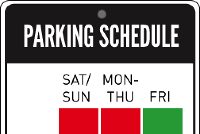
SOLUTION
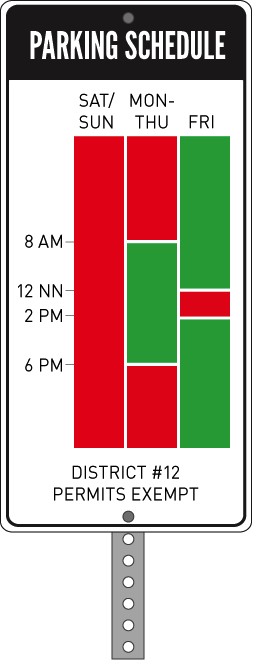
As you can see, this time chart approach dramatically simplifies the process of elimination, which is really what goes on in peoples' heads as they try to answer their question above. This way, the answer is arrived at in a simple two-step process.
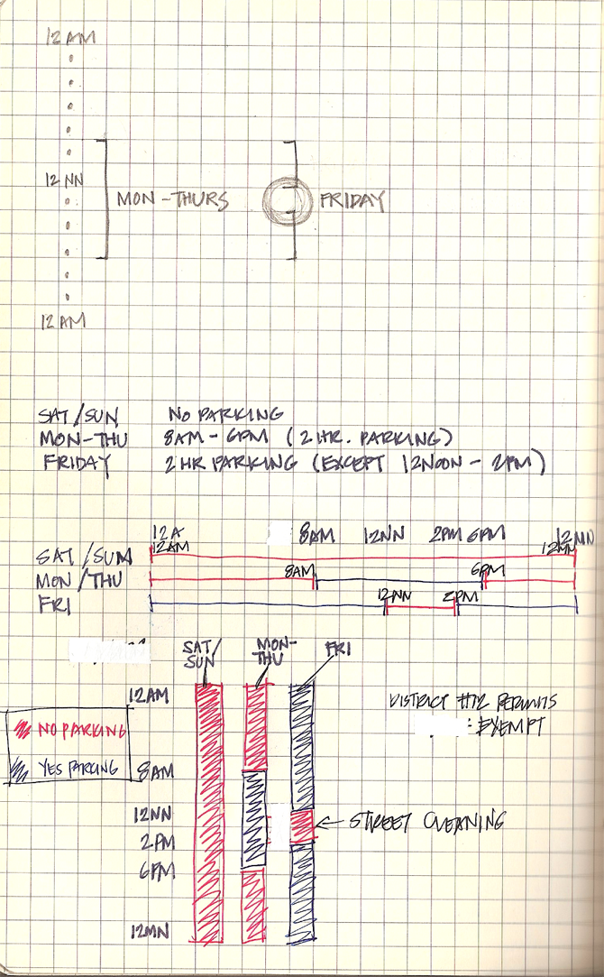
PROCESS
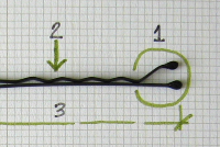
If you're interested in some doodles, here are some ideas I played with. I looked at orienting the sign horizontally, but decided that the vertical orientation was more natural to people because of their experience with the top-down time sequence on daily planner pages.